
-
Remove ads on the forum by becoming a donating member. More here. -
 20% off everything Altus the next few days at the Camino Forum Store. More here. (Discount taken at check out)
Search 69,459 Camino Questions
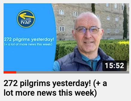
COVID Update from Santiago
- Thread starter ivar
- Start date
")


❓How to ask a question
How to post a new question on the Camino Forum.
Latest posts
-
 Help with Train from Vigo to Lisbon
- Latest: laurenligreci
-

-
Forum Rules

Camino Updates on YouTube
Most downloaded Resources
-
 “All” Albergues on the Camino Frances in one pdf“All” Albergues on the Camino Frances in one pdf
- ivar
- Updated:
-
 A selection of favorite albergues on the Camino FrancésFavorite Albergues along the Camino Frances
- Ton van Tilburg
- Updated:
-
 Profile maps of all 34 stages of the Camino FrancesProfile maps of all 34 stages of the Camino Frances
- ivar
- Updated: